After the feedback I got, the main issue was the grey’s clashed and therefore the information wasn’t easy to read.
Here is another version which I feel looks a lot cleaner to the original.

After the feedback I got, the main issue was the grey’s clashed and therefore the information wasn’t easy to read.
Here is another version which I feel looks a lot cleaner to the original.
In this stage I put all the components together and adjusted them slightly so that they would all work together. I made the mistake of creating everything separately so some of the object didn’t look right together, but this was remedied after some organisation.
I’m quite happy with the way it turned out, the main issue I have with the poster is in relation to the poster and this is purely because of how well-travelled I thought I was. According to this I’ve only really explored north and central London, which is shame in reality and also there is not a huge amount of date to be shown. However, I think this works well with the whole minimal nature of the poster, it makes it look very clean and un-cluttered.
Some of the final decisions I made were changing the colours to make certain things stand and adding a title in the corner. I think there features made the poster really pop out even though it is quite subtle.

I started making the heat-map to show areas where I spent long periods of time, however the further I got with the design the more I felt it took away from the minimalist nature of the project. It simply cluttered the poster and did not fit well with the existing designs I have. I’m scrapping this design as I feel the markers provide this information better and more concise. 
This has to be the longest part of the design so far, my god tracing these roads was a long process.
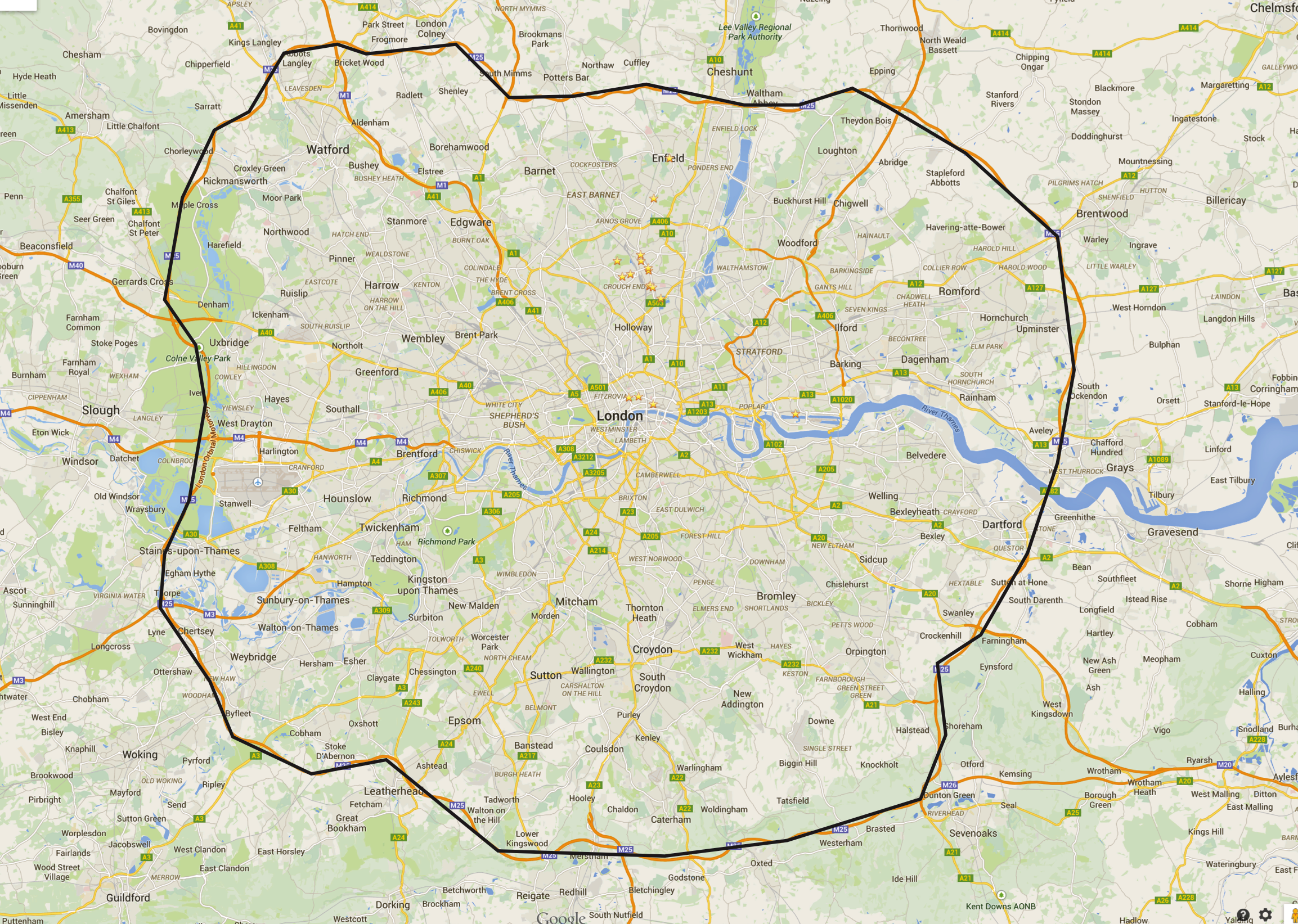
I didn’t want to poster to be overly saturated with the roads as that isn’t main focus, so therefore I made the creative decision to only include a limited number of roads so the location would appear clearly adjust the background. I also included the river thames in my design, it wasn’t entirely necessary however the map of London is iconic for the river that weaved in and out of the streets. 
Now I have started to set some markers on where I have been, I designed a little pin that will show the location on the map. The pin was inspired by Massimo Vignelli’s ‘Stendig Calendar’ which was made in 1966. It’s incredibly fascinating how something which was made so long a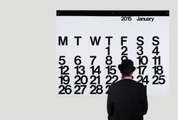 go is still a relevant piece of art, the Stendig is hugely popular amongst designers with the 2015 edition selling out within hours of release. It is truly timeless. There’s something about the minimal nature of the calendar which draws me to it, the numbers are kerned very closely to optimise space however they can still be read with ease.
This is how I used this style in my work, just keeping the bare essentials of what I need. The numbers underneath the square represent the years in which I was at that location, however if I can’t remember that far back I just insert the most recent year.


So i’m starting to develop some designs, just using trial and error to see what looks good and what needs improving.
In this instance I was looking out one of the main components of the poster, the actual map of London. I’m not worrying too much about the layout of the composition because that will be sorted out at a later date once I have everything designed, I’ll look into the different ways of laying it all out.
I mentioned the use of polygons and tessellation in the mind maps I did , I wanted to work with this theme in the the following designs. However, I first wanted to see how a smooth outline worked as a apposed to a jagged more abstract one.
For the jagged design I skipped several curves and went with instinct on where I think the lines should go, rather than focusing on the true outline. (The stars on the maps below are the markers I have set on places I have been, I will add more as I go along.)


 Verdict: Even though the smooth outline is more true to the actual map, the jagged design looks more appealing. I feel as though it looks quite minimal and contemporary. I may need to tweak it however just to see what looks best.
For this little experiment we were tasked to use our software of choice to recreate a Kokeshi Doll vector we found online. I used Illustrator for this, the image below is the reason why I gave up on Inkscape as I am just not used to the controls and it feels quite restrictive.

So as you can clearly see, me and Inkscape just do not get along and therefore I will be using Ai for the rest of this project. I tried recreating a Kokeshi doll I found online using Ai just to see how comfortable I am forming certain shapes. The image to the left is what I found online and my recreation is on the right. (You can click on it to enlarge)

I mainly used circle to create the shapes for this piece, the reason I used the shape tool over the pen tool was that I am able to make perfectly round objects. The pen tool requires far too much precision to make such shapes, but I did sacrifice the minor details in the cheek highlight; the one on the left is slightly pointer on one end as apposed to my version which is an oval.
The hardest bit to make I would say were the flower petals on her gown, it what just a bit fiddly to make sure all the objects were grouped. I found that scaling a stroked object does not affect the stroke, therefore I had to change that afterwards.
Cutting right to the chase, I don’t like Inkscape – nope nope nope just not a fan. It’s just so fiddly and unnecessary, I much prefer Adobe Illustrator partially due to the fact that I’ve used it before and I’m quite familiar with it. However I simply could not warm to Inkscape.
Below is an experimentation with Inkscape, just messing around with shapes and tools to see what I could create. On a whole I didn’t like the functionality of Inkscape, it all felt quite foreign to me and I did not like the feel.

The following is an experimentation with Ai, I was trying to get used to using it on a Mac as I used to use a PC when using the software. It was quite helpful to know all the shortcuts that could increase efficiency in the long run. The below vector is a result of me messing around with the arrangements of shapes and the circle and lines was made using something called ‘Blend’. It’s fast way of creating many shapes within a certain area.

Here are some mind maps I did to get some ideas down onto paper, I doubt I’ll use all of them but it serves as a good way to experiment and see what works best. 

If you’re not bothered to read through my scribbles, here’s a summary of my ideas:
I’ve chosen the subject ‘where have I and when?’ and I have decided to focus on London, this just allows more data to be represented. I want to touch upon the Space and Time of my time in London so I need to find a way of showing the period of time I spent at certain locations as well as accurately displaying them on a map. This bring me to my next point, I will be representing this like a map and so this will require research into cartography and map making to ensure that I can design something that is in scale to London.
I made the decision to scrap showing small things such as corner shops and small restaurants as I want to focus more on how my travels would be represented on map and I am quite lazy. Things such as school, work home, tourist spots, leisure will take up the main chunk of the poster, I will weave in other things that I find interesting, but this will require further research into where I have been (I will be marking this using Google Maps as it has a method of tagging multiple locations.
Some of the design choices include using only greyscale to show the data, I just thought this will be a refreshing way to design my poster as most infographics are deeply saturated. This has also lead me to the idea of using heat maps to show where I have been and the darker the grey, the longer I have spent at that location. I of course want everything to be clear and concise and so I am attempting a minimalistic style for the poster, this is so the information transmits with ease. I am also going to looking into pointillism to show the size of certain ares and the time spent there.
I had the idea of creating the map out of polygons or through tessellation to show everything in a unique way. Another weird idea I had was to show the journey I take between places similar to that of the tube maps, but instead it looks like a web with thicker lines to show how often I take that route.
I will be conducting more researching and sketching a whole lot more throughout this process, these are just some initial idea and what not.
